

Tables and charts
Assista X answers with tables, charts and calendars when the data calls for them. You can work with them in place: expand a table, download it, turn it into a pivot or a chart, and restyle a chart.
What you can do
| Feature | What it does |
|---|---|
| Expand a table | Open a table in a larger window |
| Download data | Export the table to CSV or Excel |
| Visualize | Turn a table into a chart with a type and color theme of your choice |
| Convert to pivot | Group a table by one column and total a numeric column |
| Chart types | Switch between bar, line, area, pie, donut, scatter, and for tables also radar, heatmap, funnel, gauge and sankey |
| Color themes | Restyle a chart with a built-in palette |
| Trend overlays | Add a trend line, a moving average and a forecast to a time series |
| Export PNG | Save a chart as an image |
| Calendar | See tasks, leaves and deadlines laid out by date |
Assista X also lets you click a row to see what is behind it, group the data differently, change the chart colors, and see where a trend is heading, all from the same answer.
Tables
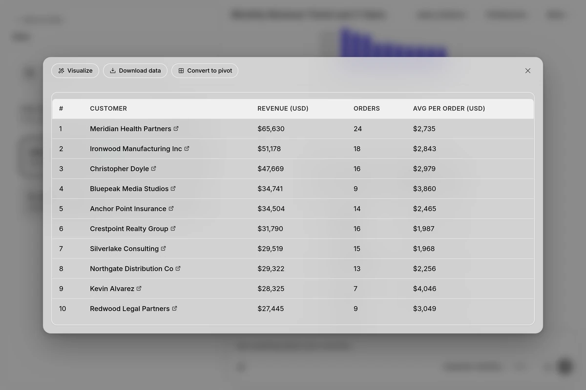
Any answer that lists records appears as a table. Move the pointer over the table and select Expand (the expand icon at the top right) to open it in a large window.
The window has these controls:
| Control | What it does |
|---|---|
| Visualize / Hide chart | Show or hide a chart built from the table. Available when the table has data that can be charted |
| Download data | Opens a menu with Export to CSV (.csv) and Export to Excel (.xlsx) |
| Convert to pivot / Show table | Switch between the table and a pivot view. Available when Assista X offers a pivot for that table |
| Close (X) | Close the window |
A table in the chat shows up to 25 rows. If more rows match, the answer says "Showing 25 of N records", and you can ask to filter further or to see more.
Pivot view
When a table has three or more columns and at least one numeric column, Assista X can offer a pivot. Select Convert to pivot and use the pivot bar:
- In Rows, choose the column to group by.
- In Values, choose the numeric column to total.
- Choose the calculation: Sum, Avg, Count, Min or Max.
The pivot lists each group, its value and its Share of the total, with a Total row at the end. Groups are sorted from the highest value to the lowest. Assista X chooses sensible defaults: Sum for money and quantities, Avg for rates and percentages, Count for categories.
You can switch the pivot offer off for a chat. See Session settings.
Charts from a table
- Expand a table and select Visualize.
- Choose a chart type from the row of types: Bar, Line, Area, Pie, Donut, Scatter, Radar, Heatmap, Funnel, Gauge or Sankey.
- Choose a color theme: Default, Sunset, Ocean, Forest or Pastel.
- Select Export PNG (the download icon) to save the chart as an image.
Charts in answers
When your data has numbers to compare, Assista X adds charts to the answer on its own. If it adds several, they appear as tabs with the chart titles.
Above a chart you see:
- Export PNG to save the chart as an image.
- A Fullscreen and Exit fullscreen button, and a Close button.
- Chart type with Bar, Line, Area, Pie, Donut and Scatter.
- Color theme with the five palettes.
- Overlays, for time series (see below).
Chart styling
Depending on your question, Assista X can also:
- Highlight named bars or slices, for example a top performer or an anomaly, with a color and a short label.
- Color points by a rule when you mention a target, budget or limit. A dashed limit line is drawn at the value, and the points that meet or miss it get different colors. This is not used for pie or donut charts.
- Use semantic colors such as red for loss and green for profit, or your own brand colors if you ask for them.
- Draw several series in one chart, for example actual against target.
Trend overlays and forecasts
For a bar, line or area chart with a time axis (months, quarters, weeks, years or dates) and at least four points, Assista X turns on Overlays. You can toggle each one:
| Overlay | What it shows |
|---|---|
| Trend line | The direction of the series |
| 3-mo avg | A moving average over three periods. Ask for another window, such as six periods, and the label changes to match |
| Forecast | The next period. Ask for two or three points to see more of them |
Overlays are not added to charts whose x axis holds names or categories, such as customers or products, because a trend over categories has no meaning. You do not need to calculate the overlays. Ask, for example, "Show monthly revenue for the last 12 months with a trend line and a forecast".
Calendars and the clock
For tasks, deadlines, leaves and other date-based records, Assista X can show a calendar. It opens in the month view, or the week view if you ask about a specific week. Events are color-coded by type: tasks blue, invoices red, leaves orange, timesheets green and sales orders purple. Dates are shown in your time zone. A clock only appears if you ask for the time.
Session settings
In the chat top bar, Session settings has two switches for the current chat:
| Switch | What it does |
|---|---|
| Charts & overlays | Auto-generate charts with trend lines |
| Pivot table hints | Suggest a pivot setup after tables |
Tips and limits
- Time-series questions get a line or area chart. Breakdowns and shares get bar, pie or donut charts.
- Charts from a table are built from the rows shown in that table.
- Ask in words to change a chart, for example "Show this as a pie chart" or "Compare this quarter by region as a bar chart".
- Use Analytical mode to get several charts for each question.